


You can watch the video instead of reading the article, or use them both:
1. Preparation – Flutter tutorial
In each episode we start from scratch by creating a new app and removing the boilerplate as shown in the following paragraphs.
First things first, to follow the series you have to have Flutter installed. To do so, please follow the official guideline: https://flutter.dev/docs/get-started/install
Secondly, create an application using the terminal. A new application can also be created using your favourite IDE’s UI. The command used below creates an application structure in the directory from which you are calling the command. To create an app type in the terminal:
flutter create onboarding_ui
Next, remove the default boilerplate from the file `onboarding_ui/lib/main.dart`. Currently the test directory would not be needed so you can remove the `onboarding_ui/test/` folder.
At the end, in order to use images on the onboarding screens which we will build, create the assets directory `assets/images` in the root directory and define it in the `onboarding_ui/pubspec.yaml` file. Add the following lines to the file under the `flutter` key:
flutter:
  ...
  assets:
    - assets/images/
    ...
Download the images package from https://static.schibsted.pl/kudify/onboarding_images.zip and unzip into the `onboarding_ui/assets/images` directory. We will use them to create nicely looking onboarding screens.
This is how the project’s structure should look like after all steps:

Now we are ready to start coding!
2. Starting point – Flutter tutorial
Within this part we will create a basic structure of the app, which will be extended in a part 3.
In the `onboarding_ui/lib/main.dart` file define the `main` function and the `App` widget as follows. Keep in mind that the app will not work yet due to the missing `OnboardingScreen` widget:
import 'package:flutter/material.dart';

void main() => runApp(App());

class App extends StatelessWidget {
  @override
  Widget build(BuildContext context) {
    return MaterialApp(
      debugShowCheckedModeBanner: false,
      title: 'Kudify App',
      home: OnboardingScreen()
    );
  }
}
Now, create the file `onboarding_ui/lib/screens/onboarding_screen.dart` in which we will define the functionality of an onboarding component.
In that file create the stateless widget named OnboardingScreen:
import 'package:flutter/material.dart';

class OnboardingScreen extends StatelessWidget {
  @override
  Widget build(BuildContext context) {
    return Container(
      child: Text('Onboarding')
    );
  }
}
and import the newly created widget in the `onboarding_ui/lib/main.dart` file by adding the import on top of the file:
import 'package:flutter/material.dart';
import 'screens/onboarding_screen.dart';
At this point the application displays the text “Onboarding” without any styles yet as shown on the screenshot.

3. Slides implementation – Flutter tutorial
Now let’s create actual onboarding slides with an animated indicator and a ‘continue’ button.
First, define the list of slides with different texts and images:
class OnboardingScreen extends StatelessWidget {
  final List<Map<String, String>> splashData = [
    {
      "title": "Kudos means\nwell done",
      "subtitle":
          "Gratitude is the most heartwarming\nfeeling. Praise someone in the\neasiest way possible",
      "image": "assets/images/splash_1.png"
    },
    {
      "title": "Get inspired",
      "subtitle":
          "Browse kudos list. See what your\ncommunity is up to and\nget inspired",
      "image": "assets/images/splash_2.png"
    },
    {
      "title": "Spread\nkindness",
      "subtitle":
          "Do your best in your day to day life\nand unlock achievements",
      "image": "assets/images/splash_3.png"
    },
  ];
  ...
}
Now add the page controller and current page number variable to have a control over the slides which we will add in a minute.
First, add the OnboardingScreen class which extends StatefulWidget and change the old OnboardingScreen class to the _OnboardingScreenState. Add a controller variable and current page.
class OnboardingScreen extends StatefulWidget {
  @override
  _OnboardingScreenState createState() => _OnboardingScreenState();
}

class _OnboardingScreenState extends State<OnboardingScreen> {
  final _controller = PageController();
  int _currentPage = 0;

  List<Map<String, String>> _getSplashData() => [
  ...
}
Now let’s build a scaffold with slides and with the changePage method to change the current slide number.
You might have noticed that we used a word const in `const Color(0xFF424242)`. The reason is that flutter will create only one instance of the variable. It is a proper way from the performance perspective. In the following article you can find a full explanation: https://news.dartlang.org/2012/06/const-static-final-oh-my.html
The screen will be divided into two parts with Expanded class. Giving them flex: 3 and flex: 1 properties they cover 3/4 and 1/4 of the screen.
class _OnboardingScreenState extends State<OnboardingScreen> {
 ...

 @override
  Widget build(BuildContext context) {
    return Scaffold(
      body: SafeArea(
        child: Column(
          children: <Widget>[
            Expanded(
              flex: 3,
              child: PageView.builder(
                controller: _controller,
                itemCount: splashData.length,
                itemBuilder: (BuildContext context, int index) {
                  return Column(
                    children: <Widget>[
                      Padding(
                        padding: const EdgeInsets.only(top: 20.0),
                        child: Image.asset('assets/images/logo.png'),
                      ),
                      Spacer(flex: 2),
                      Padding(
                        padding: const EdgeInsets.only(bottom: 15.0),
                        child: Text(
                          splashData[index]['title'].toUpperCase(),
                          textAlign: TextAlign.center,
                          style: TextStyle(
                            fontSize: 22,
                            fontWeight: FontWeight.w800,
                            color: const Color(0xFF424242),
                          ),
                        ),
                      ),
                      Text(
                        splashData[index]['subtitle'],
                        textAlign: TextAlign.center,
                        style: TextStyle(
                          fontSize: 14,
                          color: Colors.grey[600],
                          height: 1.5,
                        ),
                      ),
                      Spacer(
                        flex: 2,
                      ),
                      AspectRatio(
                        aspectRatio: 16 / 9,
                        child: Image.asset(
                          splashData[index]['image'],
                          fit: BoxFit.contain,
                        ),
                      ),
                      Spacer(),
                    ],
                  );
                },
                onPageChanged: (value) => setState(() => _currentPage = value),
              ),
            ),
          ],
        ),
      ),
    );
  }
}
At this point the app allows you to swipe slides and looks like on the screenshot below.

Now let’s add an animated current slide indicator and the continue button into the children array. Again we are using the Expanded class with a flex property as mentioned above. The following code also renders a text on the button conditionally.
  @override
  Widget build(BuildContext context) {
    final splashData = _getSplashData();

    return Scaffold(
      body: SafeArea(
        child: Column(
          children: <Widget>[

            ...

            Expanded(
              flex: 1,
              child: Column(
                mainAxisAlignment: MainAxisAlignment.start,
                children: <Widget>[
                  Padding(
                    padding: const EdgeInsets.only(top: 40.0),
                    child: Row(
                      mainAxisAlignment: MainAxisAlignment.center,
                      children: List.generate(
                        splashData.length,
                        (int index) => _buildDots(index: index),
                      ),
                    ),
                  ),
                  Spacer(),
                  Padding(
                    padding: const EdgeInsets.symmetric(horizontal: 40.0),
                    child: SizedBox(
                      height: 45,
                      width: MediaQuery.of(context).size.width,
                      child: FlatButton(
                        onPressed: () {
                          _controller.nextPage(
                            duration: const Duration(milliseconds: 200),
                            curve: Curves.easeIn,
                          );
                        },
                        child: Text(
                          _currentPage + 1 == splashData.length
                              ? 'Go to app'
                              : 'Continue',
                          style: TextStyle(
                            fontSize: 14,
                            color: Colors.white,
                          ),
                        ),
                        shape: RoundedRectangleBorder(
                          borderRadius: BorderRadius.circular(10),
                        ),
                        color: const Color(0xFF68B684),
                      ),
                    ),
                  ),
                  Spacer(),
                ],
              ),
            )

            ...
Now we have to define the `_buildDots` method which renders the animated indicator. Add this method to the `_OnboardingScreenState` class.
Please notice the usage of a named parameter {int index} in the example below. To read more about named parameters, follow this article: https://dart.dev/guides/language/language-tour#parameters
class _OnboardingScreenState extends State<OnboardingScreen> {
  ...

  AnimatedContainer _buildDots({int index}) {
    return AnimatedContainer(
      duration: const Duration(milliseconds: 200),
      decoration: BoxDecoration(
        borderRadius: BorderRadius.all(
          Radius.circular(50),
        ),
        color: const Color(0xFF293241),
      ),
      margin: const EdgeInsets.only(right: 5),
      height: 10,
      curve: Curves.easeIn,
      width: _currentPage == index ? 20 : 10,
    );
  }

  ...
}
In the result your app should look like on the screenshot.
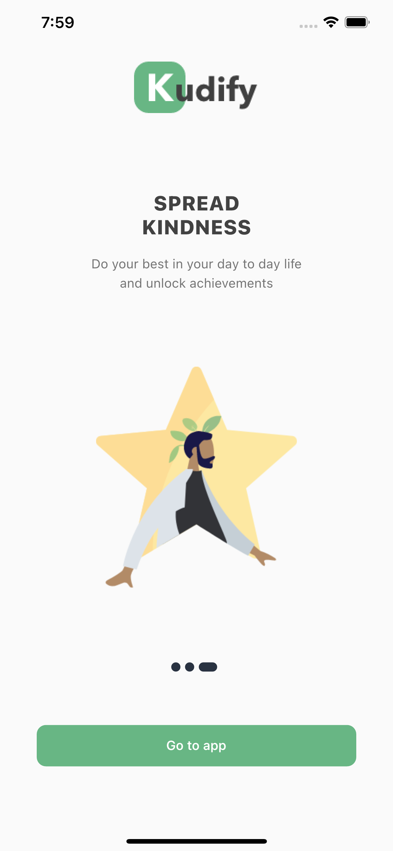
Finally, you have built a fully functional onboarding screen! Well done.
To learn more about classes used in this article, follow the official documentation:
- AnimatedContainer: https://api.flutter.dev/flutter/widgets/AnimatedContainer-class.html
- PageController: https://api.flutter.dev/flutter/widgets/PageController-class.html
- StatelessWidget: https://api.flutter.dev/flutter/widgets/StatelessWidget-class.html
- StatefulWidget: https://api.flutter.dev/flutter/widgets/StatefulWidget-class.html
- Const and final keywords: https://news.dartlang.org/2012/06/const-static-final-oh-my.html
Link to the final version of the app with implemented onboarding:
https://github.com/KrzysztofLen/Flutter_crash_course/tree/master/onboarding_part_1
Thank you for following this episode of our Flutter tutorial.
Stay tuned for the next episode, in which we will build together a grid and a list view to display a list of people.
Coding – Krzysztof Len
Video – Robert Fijałkowski