


Note: this article was previously published on Marcin’s Medium.com profile. The author agreed to republish the article on the Schibsted Developers Blog.
Material Design introduced many good ideas into the Android UI world. One it’s fundamental component is card view. Basically, it’s a rectangle layer with rounded corners and smooth shadow around, making it looking elevated a bit. In some cases, the use of the CardView may not be sufficient or even unnecessary. For example, placing many rows inside one card with recycler view can be tricky.
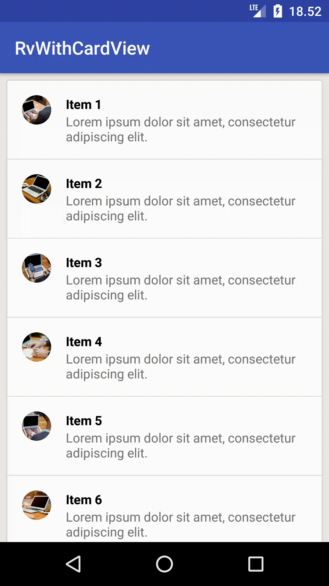
Items inside CardView
As we now know that we will have fixed items number, then we can just build a simple static layout for them. What if we don’t know exact items count or we know there might be a lot of items? This post describes how to use RecyclerView, a view’s property “elevation” and specially prepared backgrounds to presents many items on a card.
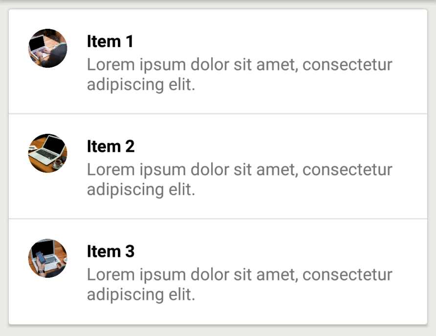
Just a simple card list
Creating a list containing cards with whatever you want content is quite simple. You just need to create an adapter, which one will handle creation and item view holder binding. For item’s layout, we’ll use CardView and… that’s it!
Ideas and issues
In our case, to achieve the presented result, we won’t use CardView component, because it’s not allowing us to set which corners should be rounded. For example: we would have rounded only top corners — the first item on the list.
Next idea could be placing a CardView as a single view in a RecyclerView and drawing rows as a subview of the card. This approach isn’t perfect as well because we prevent items from being recycled (from the RecyclerView perspective we have only one big item).
Another solution could be placing RecylerView inside CardView and setting the height to wrap content. Unfortunately, this makes items scrollable inside CardView instead of the whole screen.
A better way
My suggestion is to create item layout based on standard layout (RelativeLayout in our case) and set proper elevation to it. Of course, we also need to set a padding and “clipToPadding” flag to false on our RecyclerView.
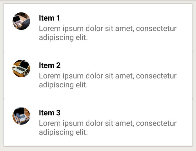
First version — just elevation and paddings
Next step is to prepare four backgrounds for list items. Why four? We need a background for:
- the first item — rounded only top corners and bottom horizontal separator’s line,
- the last item — rounded only bottom corners,
- middle elements — just horizontal line,
- single element — when there’s only one item on the list — rounded all corners.
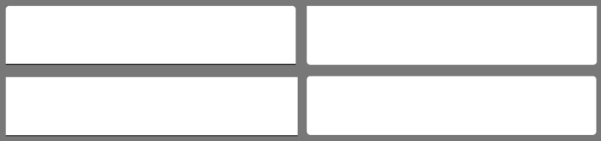
Different backgrounds for items: first, last, middle, single
Prepared in that way backgrounds apply in onBindViewHolder method depending on item position.
fun bindBackground(itemView: View, position: Int, size: Int) {
    val drawableRes: Int = when {
        size == 1 -> R.drawable.item_top_bottom
        position == 0 -> R.drawable.item_top
        position == size - 1 -> R.drawable.item_bottom
        else -> R.drawable.item_middle
    }
    itemView.background = ContextCompat
            .getDrawable(itemView.context, drawableRes)
    itemView.setPadding(contentPadding, contentPadding,
            contentPadding, contentPadding)
}
One more thing…
It seems that everything is ready but when you take a closer look at items separator line you can notice strange graphical artifacts.
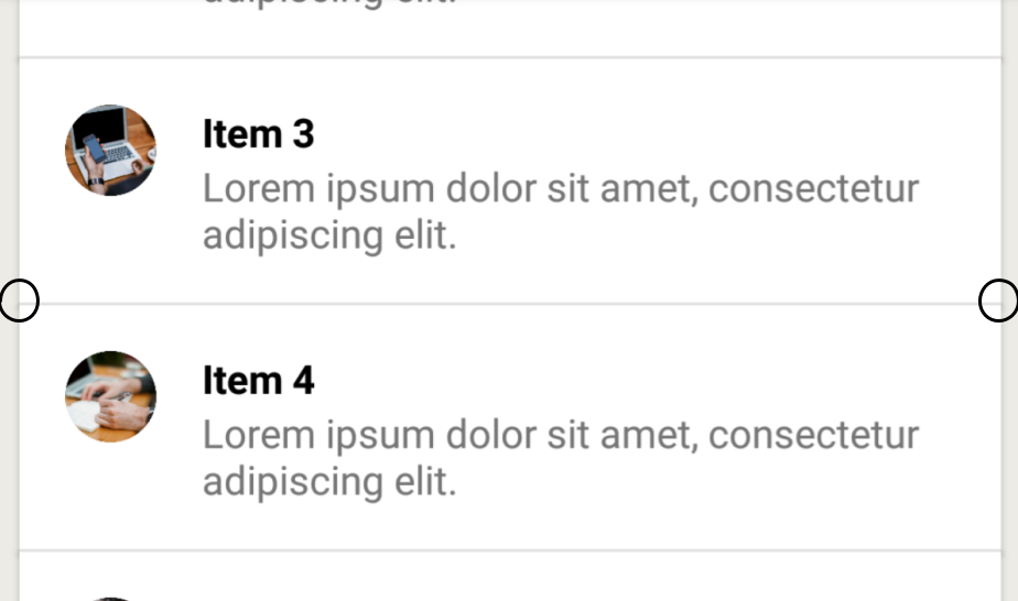
Undesirable graphical artifacts
This is due to the overlap of the item’s shadow. To get rid of that we’ll set custom outline provider. We need to use ViewOutlineProvider class and override getOutline method with fixed shadow’s outline. We apply this provider for all items except the first one. For the first or single row we use ViewOutlineProvider.BACKGROUND.
override fun getOutline(view: View, outline: Outline) {
    val resources = view.resources
    outline.setRect(
            0,
            resources.getDimensionPixelSize(R.dimen.cardElevation),
            view.width,
            view.height
    )
}
As you might have noticed, using components provided with framework or library is not always the best option. Sometimes writing your own custom implementation can be really useful and very exciting.